Copyright © 2006 Avi Alkalay, Donovan Rebbechi, Hal Burgiss
2007-04-15
| Revision History | ||
|---|---|---|
| Revision 2007-04-15 | 15 Apr 2007 | avi |
| Included support to SUSE installation for the RPM scriptlets on template spec file, listed SUSE as a BCI-enabled distro. | ||
| Revision 2007-02-08 | 08 Feb 2007 | avi |
| Fixed some typos, updated Luc's page URL, added DejaVu sections, added link to FC6 Freetype RPMs, added link to Debian MS Core fonts, and added reference to the gnome-font-properties command. | ||
| Revision 2006-07-02 | 02 Jul 2006 | avi |
| Included link to Debian FreeType BCI package, improved the glossary with Latin1 descriptions, more clear links on the webcore fonts section, instructions on how to rebuild source RPM packages in the BCI appendix, updated the freetype recompilation appendix to cover new versions of the lib, authorship section reorganized. | ||
| Revision 2006-04-02 | 02 Apr 2006 | avi |
| Included link to FC5 Freetype.bci contribution by Cody DeHaan. | ||
| Revision 2006-03-25 | 25 Mar 2006 | avi |
| Updated link to BCI Freetype RPMs to be more distro version specific. | ||
| Revision 2005-07-19 | 19 May 2005 | avi |
| Renamed Microsoft Fonts to Webcore Fonts, and links updated. | ||
| Revision 2005-05-25 | 25 May 2005 | avi |
| Comment related to web pages in the Microsoft Fonts section | ||
| Revision 2005-05-10 | 10 May 2005 | avi |
| Old section-based glossary converted to real DocBook glossary. | ||
| Revision 2005-03-31 | 31 Mar 2005 | avi |
| Desktop configuration guidelines improved for higher resolution screens. | ||
| Revision 2005-02-18 | 18 Feb 2005 | avi |
| Included BCI support status for Mandrake and Gentoo. | ||
| Revision 2005-01-12 | 12 Jan 2005 | avi |
| E-mail addresses more difficult to figure out for machines. | ||
| Revision 2004-12-24 | 24 Dec 2004 | avi |
| Small corrections and DocBook improvements. | ||
| Revision 2004-12-12 | 12 Dec 2004 | avi |
| Typos correction by Scott Brayban (sgrayban borgnet us). | ||
| Revision 2004-12-05 | 5 Dec 2004 | avi |
| Merged with FDU-HOWTO. | ||
| Revision 2004-11-27 | 27 Nov 2004 | avi |
| Created first sections. | ||
- 1. Introduction
- 2. Why Fonts on Linux Aren't Straight Forward ?
- 3. The Easy Steps to Enlighten Your Desktop
- 4. Font Packages
- 5. Producing Portable Documents
- 6. Create RPMs of Your Fonts
- 7. Designer's Guide for Modern Good Looking Documents
- 8. Font Technologies
- 9. Getting Fonts For Linux
- 10. Useful Font Software for Linux
- 11. Ethics and Licensing Issues Related to Type
- 12. References
- Glossary
- 1. Recompiling FreeType for BCI
- 2. Recompiling an RPM Ready for Your Distribution
- 3. We Need Your Help
- 4. About this Document
You can have the coolest desktop widget theme, the most enlightened colors combination, and a very nice background wallpaper. Your desktop still won't look professional, clean, beautiful, and most important, comfortable, without good fonts.
It is a common sense nowadays that good fonts are a key element for good desktop usability, because we use to spend hours per day in front of computers, writing documents, dealing with huge spreadsheets, making presentations, browsing and chatting. So we are all the day reading text.
The font subsystem on Linux evolved a lot in the last years, from an old naming, handling and option of fonts, to the support of True Type, Bistream Vera, etc. As of release time of Fedora Core 2, components like Xft, FreeType and FontConfig, and higher level software usage of them has stabilized and is now considered mature. But Linux still has issues with optimal font rendering, most of them related to software patents that we describe in Section 2, “Why Fonts on Linux Aren't Straight Forward ?” below.
Jump to Section 3, “The Easy Steps to Enlighten Your Desktop” if you just want to fix your desktop fonts fast. Read this section if you are interested in the details on how and why make it.
Fonts are used on the screen and for printing. These medias differ a lot in DPI resolution: screens have 72 to 96 DPI, while modern printers use to have 300 DPI. So low-resolution medias as the screen need better font rendering algorithms to workaround the media's limitations.
To get optimal fonts on the screen you need:
-
Good fonts designed for low resolution media.
True Type font technology evolved to be the best thing you can get nowadays. But for optimal screen beauty, you also need fonts that were designed for this purpose. We found that Tahoma and Verdana are the best fonts you can get for the screen.
-
A good font renderer.
Current Linux distributions include the excelent and very mature FreeType font renderer library.
A .ttf file contains information to draw the characters at any size, so you eventually can convert a text into a scalable outline drawing (built from line segments and quadratic bezier arcs) with tools like OpenOffice.org or CorelDraw.
Font drawing algorithms are extremely complex because they have to decide which pixels to highlight based on the mathematical equations inside the .ttf file. When you need text in big sizes like 48 or 60, one or two pixels these algorithms "forget" to highlight doesn't make much difference, but when you need text at size 8pt or 11px, each pixel counts. And these use to be the text size for KDE and Gnome widgets, text for web browsing, and almost everything else we see on the screen.
To solve this problem more efficiently, beside of the mathematical equations inside a .ttf file, a font designer (a human being with a font creation software) also put some extra information to help the font renderer make correct decisions for this small size text. This process is called grid-fitting or hinting.
The point is: the technologies to interpret this hinting information are patented by Apple, and they are commonly called True Type Byte Code Interpreters (or simply BCI in our document, from now on).
With reverse engineering, the Freetype Project has implemented a byte code interpreter, but due to legal issues in some countries, some Linux distributions disable it at compilation and packaging time. This is a list of distributions that are known to enable or disable BCI. Please send us updates.
Table 1. FreeType Bytecode Interpreter Status per Distribution
| Support | No Native Support |
|---|---|
| Conectiva | Mandrake |
| Gentoo | Red Hat, Fedora |
| SUSE |
FreeType tries to workaround this legal issues developing autohinting algorithms, but in our tests, BCI algorithms gave us much better font rendering results on the screen.
At the present time, X.org and XFree86 use two font subsystems, each with different characteristics:
-
The original (15+ year old) subsystem is referred to as the "core X font subsystem". Fonts rendered by this subsystem are not anti-aliased, are handled by the X server, and have names like:
-misc-fixed-medium-r-normal--10-100-75-75-c-60-iso8859-1 -
The newer font subsystem is known as "fontconfig", and allows applications direct access to the font files. Fontconfig is often used along with the Xft library, which allows applications to render fontconfig fonts to the screen with antialiasing. Fontconfig uses more human-friendly names like:
Luxi Sans-10
Over time, fontconfig/Xft will replace the core X font subsystem. At the present time, applications using the Qt 3 or GTK 2 toolkits (which would include KDE and GNOME applications) use the fontconfig and Xft font subsystem; most everything else uses the core X fonts.
In the future, Linux distributions may support only fontconfig/Xft in place of the XFS font server as the default local font access method.
![[Note]](images/note.gif)
|
Note |
|---|---|
| An exception to the font subsystem usage outlined above is OpenOffice.org (which uses its own font rendering technology). |
You'll have to:
-
Update the FreeType library package on your system with one compiled with BCI support.
-
Install the Webcore Fonts package (a.k.a. Microsoft fonts).
-
Follow the instructions below on how to configure your desktop and common applications.
FreeType compiled with BCI presented much better screen font rendering results.
Get RPMs for your distribution here:
-
Fedora 5 RPMs by Cody DeHaan.
-
CentoOS or Red Hat Enterprise Linux 3 and 4, and Fedora 3 and 4 RPMs.
-
Mandrake RPMs through the Penguin Liberation Front website. The package name is libfreetype6.
-
Debian Sarge users have the BCI enabled FreeType from the "testing" and "unstable" package repositories. Next stable Debian version will include it as their default. The Debian package name is libfreetype6.
If you use one of these distributions, but on a platform that binary RPMs are not being provided, you can easily compile your own (even if you don't have any software compilation skills) following the instructions on Appendix 2, Recompiling an RPM Ready for Your Distribution.
WE WILL ACCEPT CONTRIBUTIONS of distribution specific FreeType repackaging, so if you can contact us, we appreciate.
If you are interested in repackaging your own FreeType, see how we repackage the Fedora Core and Red Hat RPMs with BCI on the Appendix 1, Recompiling FreeType for BCI as a reference.
General Guidelines
The main idea is to use good hinted fonts all around. As a general rule, we'll use Tahoma 8pt for desktop widgets, LucidaTypewriter 8pt for monospace text, and Verdana 8pt, 9pt or 10pt for fluent text reading or web surfing. These are the default font sizes on a Microsoft Windows desktop, and they look good on a 1024x768 screen. If you have a better screen resolution (1280x1024, 1600x1200) our suggestion is to stick with these fonts but increase their sizes.
We choose these fonts, specially Microsoft's Tahoma and Verdana, because they look perfect at small sizes (8pt, due to their excellent hinting), providing a more efficient screen utilization. They'll make your desktop look beautiful, professional, clean and comfortable. These fonts were designed for this purpose.
For window titles or text that will appear in bigger sizes, you may choose whatever you want because bigger sizes hinting are not so relevant.
Anti-Aliasing is a technique used to reduce the "steeper" effect on low-resolution medias, so it can be used to improve the quality of text on the screen. It is also used to blur the imperfections of bad hinted fonts at small sizes. For desktop widgets (usually with small size), some people think it makes the desktop look dirty.
So a practical conclusion we found is to use Anti-Aliasing for sizes bigger than 10pt, and use good hinted fonts for smaller sizes without Anti-Aliasing. Currently the best hinted fonts you can find, as we cited before, are the ones found in the Webcore font package.
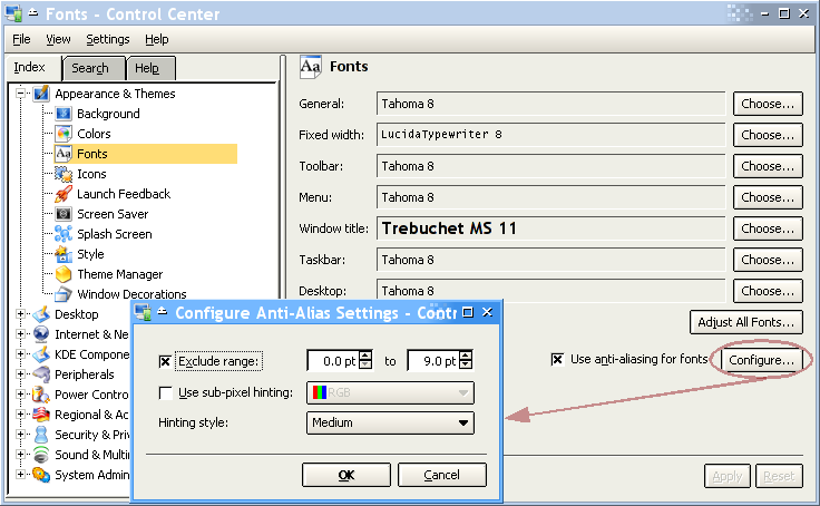
To configure KDE, use the Control Center (kcontrol in the command line). This is how I have it configured.
So we basically chose Trebuchet 12pt as the window title font, the bitmap font LucidaTypewriter 8pt for fixed size text, and Tahoma 8pt for everything else, which includes menus, buttons, etc. The 2 first should follow your taste, but Tahoma 8pt for all the rest is the optimal configuration, also used by MS Windows 2000 and XP.
One other thing to note is that I disabled anti-aliasing for font sizes up to 9 points. Look at the entire dialog and see how all text is clearly rendered, looks clean precise and professional.
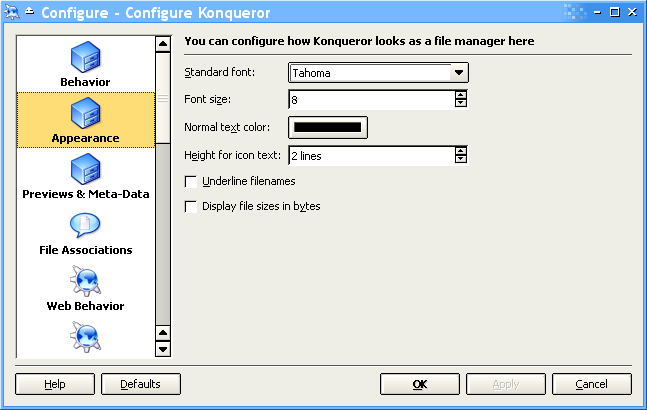
Konqueror (KDE's browser and file manager) also needs font configuration for beautiful web browsing and file management.
We used the same Tahoma 8pt for rendering the list of files in Konqueror's window, because Tahoma was simply designed with this purpose in mind, with 8pt being its most important size, with no need of anti-aliasing to be clear and beautiful.
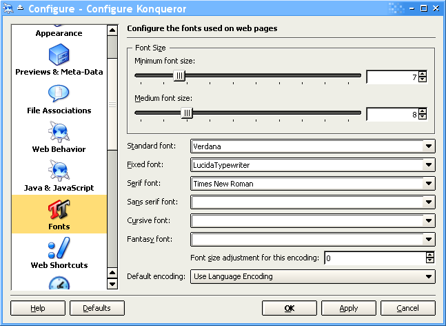
And this is finally for web browsing. We are using Verdana as the general font because it was simply designed for the purpose of fluent text reading on the screen. And the old LucidaTypewriter when a web page requested a fixed size font. Some may choose fonts like Courier or Bistream Vera Mono here.
We left all other fonts blank, to let the page choose it. But you may use Times New Roman as the Serif Font. Read more about serif fonts in Section 7.2.2, “To serif or not to serif ?”.
The sizes of the fonts for browsing are a bit personal and depends on how healthy are your eyes, and the resolution of your screen. In my 1024x768 screen I use default size as 8pt, and I don't want web pages to use sizes smaller than 7pt. In the end of the day, to set the size is not so effective because modern web pages use to set them with absolute values. So it is more practical to use the browsers menu to "zoom" the page you are currently seeing.
One more thing to note is the Default Encoding. This is a quite complex subject that deserves an entire HOWTO, but it is generally OK to leave it as the Language Encoding. You may need to change it if you frequently browse pages with non pure ASCII (international text) made by irresponsible webmasters that still don't use UTF-8 for the web. But here also it may be more practical to use the menu to set the encoding for the current page you are browsing.
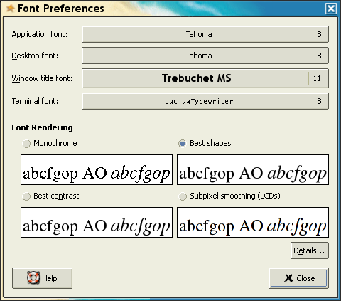
We'll use our generic rules here too: Tahoma 8pt for everything. Navigate preferences menu to invoke the following dialog or just run gnome-font-properties from the command line.
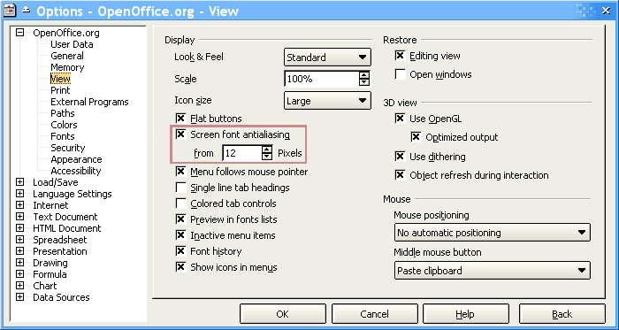
As of Fedora Core 3 time, OpenOffice.org 1.1.2 has look (but not feel) integration with KDE and Gnome. This means that your environment should tell OOo how to use widget fonts. But we found it didn't really work. With further investigation we found that only the non-AA configuration we made was not propagated to OOo. So we used OOo's own dialogs to change it.
So we basically selected , menu, and in the View section we enable OOo to do anti-aliasing at font sizes beginning with 12 pixels (approximately 9pt), and the result is what you can see above: clean and comfortable widgets with Tahoma 8pt.
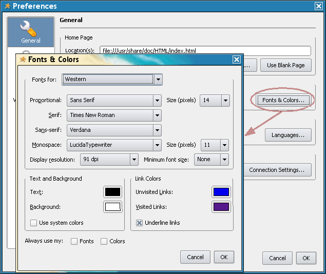
Mozilla Firefox follows the same Konqueror rules.
So we -> and then , and selected Verdana 14px for general browsing and LucidaTypewriter 11px for monospace text.
Firefox is a Gnome application, so it will use Gnome's font settings for widgets.
Additionaly, a very interesting way to configure some font rendering aspects of Firefox is described in a Mandrake Wiki.
3.2.6. Beautiful Alternatives Without Webcore Fonts
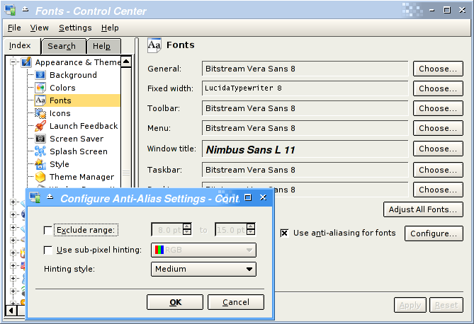
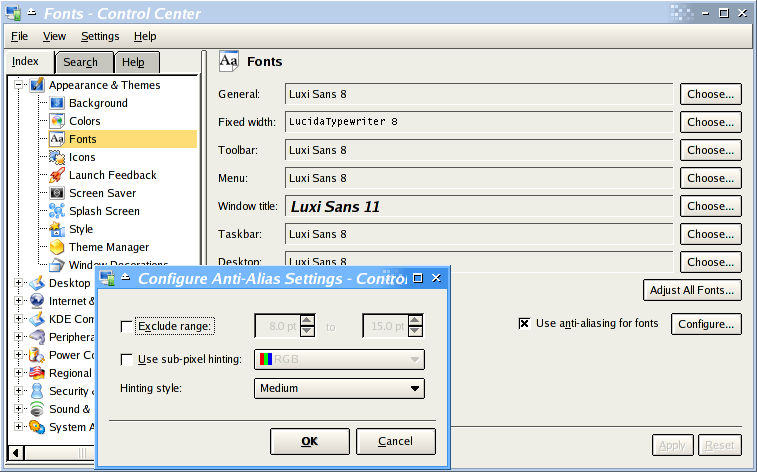
If you want to stay away from patents and proprietary fonts, the best way to go is with Bitstream Vera Sans 8pt, Nimbus Sans 8 or 9pt, or Luxi Sans 8 or 9pt (also known as Sans, simply) for desktop widgets, and bigger sizes for fluent text reading. You'll need Anti-Aliasing to blur the low quality of the hinting of these fonts.
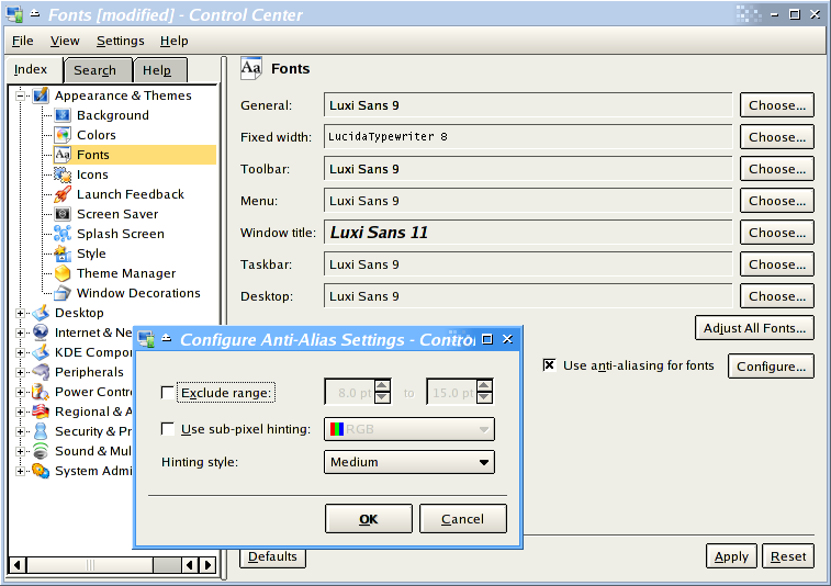
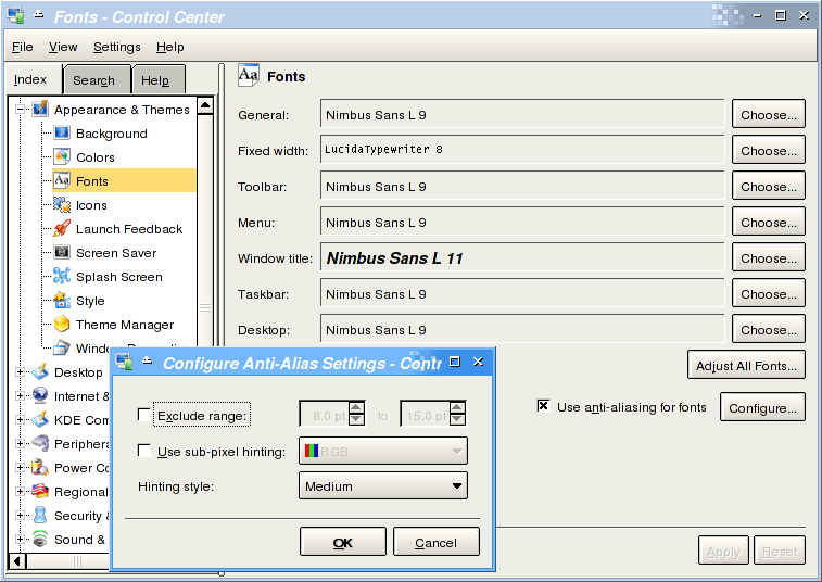
Here are some screen shots about the usage of these fonts on KDE. You should pay attention on how the widgets text on this window are rendered.
As you can see, the results aren't so good as Tahoma 8pt.
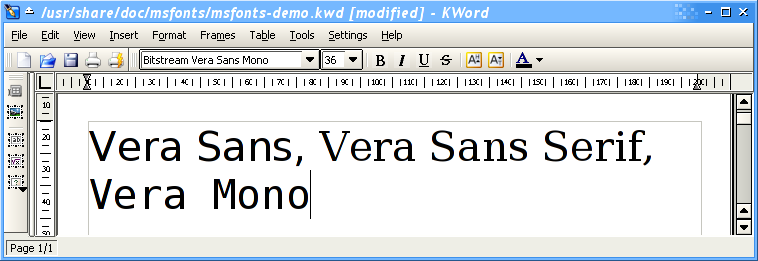
Bitstream donated to the open world their Vera set of fonts, which are good quality and include a sans, sans serif and monospace fonts. This fonts are not very well hinted but can be used for desktop widgets, programming, fluent text reading and web surfing. Here is a screen shot:
At these sizes, these fonts look great, specially with anti-aliasing. But unfortunately their bad hinting can be noted at small sizes.
Bitstream Vera fonts are included by default in all modern Linux distributions.
The DejaVu fonts are modifications of the Bitstream Vera fonts designed to extend this original for greater coverage of Unicode. It is being included by default in all modern Linux distributions, and everywhere you were thinking to use Bitstream Vera, DejaVu is another option with a more complete Unicode set.
The official distribution of these fonts for Linux include tarballs and RPMs for several distributions.
Also known as the Microsoft fonts, these are the best fonts available to be used on the screen. Very well hinted for small sizes makes them perfect for desktop widgets, fluent text, etc.
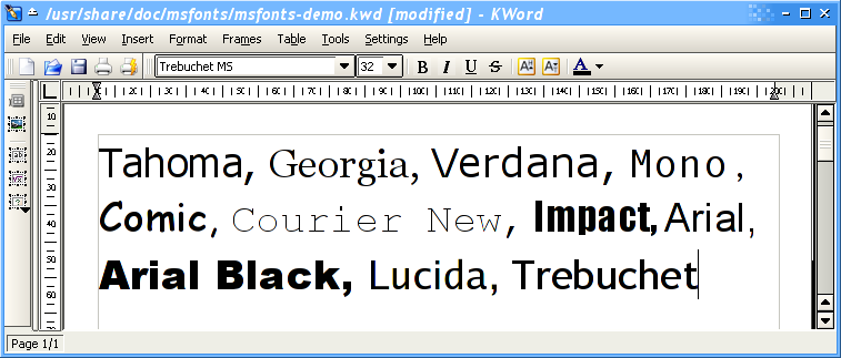
They are Verdana, Tahoma, Times New Roman, Arial, Trebuchet, Comic Sans, Impact and others. Here is a screen shot of them:
As we said before, Tahoma and Verdana were designed for the screen, but they are getting overused for many other purpose.
Our objective here is to provide links where you can get good quality RPMs, debs, etc for your distribution. These packages are provided by independent contributors, so if you have the skills to build them for your distribution, please contact us and send the URL for your packages. WE WILL ACCEPT CONTRIBUTIONS.
Packages for distributions:
-
Red Hat and Fedora RPMs. This is the orignal package, and it is reported to work in many other distributions.
-
Debian Sarge (currently stable) and Etch (soon to be stable) both contain a package called msttcorefonts which contains the MS core fonts. Most Debian users running a GUI will probably install it.
-
Please send us more, such as Slackware and Debian packages.
After installing this font package you'll also note a better rendering of web pages, because professional web designers use to use them for their pages.
Some people say these fonts are free only for persons who have a Microsoft Windows license.
Yes, we know you had created rich documents, presentations, spreadsheets and web pages that looked great in your computer, but when opened in your friend's machine they looked completely unformated. So lets discuss here some good practices we found to avoid these annoying drawbacks.
If you need to exchange documents with Windows users, you should use Windows fonts. This is the general rule. So you should install the Webcore Fonts package and take care to use only Arial, Times New Roman, Verdana, etc, on your docs.
The combination of these fonts with the cross-platform, high quality OpenOffice.org suite, gives you a truly productive teamwork tool.
The fonts available on modern Linux distributions, to produce good quality documents are the following:
Table 2. General Linux Free Fonts
| Fonts |
|---|
| Bitstream Charter |
| Bitstream Vera family |
| Century Schoolbook |
| Luxi family |
| Nimbus family |
| URW Palladio |
| URW Bookman |
| URW Chancery |
| URW Gothic |
| Utopia |
Using these fonts you'll be able to safely exchange and print documents between different modern Linux distributions.
There are other fonts available on your Linux system, but we did not list them here because they are low-quality (obsolete) bitmap fonts, to be used on the screen, and not for documents.
The title says it all. OpenOffice.org's all platform packages include the Bitstream Vera package. So if you'll take care to use only these fonts, your documents will open nicely in any other OpenOffice.org installation.
As a side note, OpenOffice.org excels in portability. In any platform, OOo looks and works the same, and it takes special care with your documents layout. It is simply a great tool.
To make your documents have a professional look, you should choose the correct font for the document purpose. Our current culture standardized that serif fonts (Times, etc) are the right choice for books and magazines. Now sans-serif fonts (Arial, Helvetica, Verdana) are gaining space and some may feel these fonts provide a more modern look, because of their lack of serifs. We have seen them being used in printed articles and commercial proposals.
For web pages, Arial and Helvetica or specially Verdana, are definitively the right choice.
For further more deep information, please refer to Section 7, “Designer's Guide for Modern Good Looking Documents”, by Donovan Rebbechi on typography, about cultural and social facts that influenced font designing evolution, and what are being produced today by designers.
Do not just throw .ttf files someplace on your system. It makes migrations more difficult, and makes a big mess in your computer. Package management software like RPM lets you easily install your fonts in an organized standard way, manage font upgrades, and make massive font distribution a piece of cake.
Here we'll provide templates and instructions for you to easily build RPM packages of your fonts. We'll accept contributions with instructions to build different types of packages.
To build RPMs, you need a special structure of directories and some configurations on your environment. You should do everything as a regular user, in all steps. In fact, we recommend that you do not do this as root.
To create this directories, do this:
bash$cd ~bash$mkdir -p src/rpmbash$cd src/rpmbash$cp -r /usr/src/redhat/* .bash$lsBUILD/ RPMS/ SOURCES/ SPECS/ SRPMS/bash$
(the "~" is an alias to the current user's home directory name, and the command line knows it should interpret it this way)
Of course this is on a Red Hat system, but the important point is to have the following directories under src/rpm:
-
BUILD/ -
RPMS/noarch/ -
SRPMS/
Then, you'll have to create the .rpmmacros file in you home directory, with this single line content:
%_topdir YOUR_HOME_DIR_HERE/src/rpm
And you should substitute YOUR_HOME_DIR_HERE with the absolute name of your $HOME directory. So as an example, my .rpmmacros file contains this line:
%_topdir /home/aviram/src/rpm
Now you must think about a name for your font collection. To make things easy in this documentation, we'll use the name myfonts from now on. Then you must create a directory named ~/src/myfonts/myfonts (yes, myfonts two times) and put all your .ttf files right under it. So you'll have something like:
bash$cd ~/srcbash$find myfonts/myfonts/myfonts/myfonts/ myfonts/myfonts/font1.ttf myfonts/myfonts/font2.ttf myfonts/myfonts/font3.ttf ...
To build an RPM package you'll have to create a .spec file that provides instructions to the package builder on how to organize the files, package description, author, copyright, etc. We provide a template here that you can use to start your work. The template looks like this:
Example 1. The .spec file template
Name: myfontsSummary: Collection of My Funny Fonts
Version: 1.1
Release: 1 License: GPL
Group: User Interface/X Source: %{name}.tar.gz BuildRoot: %{_tmppath}/build-root-%{name} BuildArch: noarch Requires: freetype Packager: Avi Alkalay <avi unix sh>
Prefix: /usr/share/fonts Url: http://myfonts.com/
%description
These are the fonts used in our marketing campaign, designed by our marketing agency specially for us. The package includes the following fonts: Font 1, Font 2, Font 3, Font 4. %prep %setup -q -n %{name} %build %install mkdir -p $RPM_BUILD_ROOT/%{prefix} cp -r %{name}/ $RPM_BUILD_ROOT/%{prefix} %clean rm -rf $RPM_BUILD_ROOT %files %defattr(-,root,root,0755) %{prefix}/%{name} %post { if test -x /sbin/conf.d/SuSEconfig.fonts ; then # This is a SUSE system. Use proprietary SuSE tools... if test "$YAST_IS_RUNNING" != "instsys" ; then if test -x /sbin/SuSEconfig -a -f /sbin/conf.d/SuSEconfig.fonts ; then /sbin/SuSEconfig --module fonts else echo -e "\nERROR: SuSEconfig or requested SuSEconfig module not present!\n" ; exit 1 fi fi if test -x /sbin/conf.d/SuSEconfig.pango ; then if test "$YAST_IS_RUNNING" != "instsys" ; then if test -x /sbin/SuSEconfig -a -f /sbin/conf.d/SuSEconfig.pango ; then /sbin/SuSEconfig --module pango else echo -e "\nERROR: SuSEconfig or requested SuSEconfig module not present!\n" ; exit 1 fi fi fi else # Use regular open standards methods... ttmkfdir -d %{prefix}/%{name} \ -o %{prefix}/%{name}/fonts.scale umask 133 /usr/X11R6/bin/mkfontdir %{prefix}/%{name} /usr/sbin/chkfontpath -q -a %{prefix}/%{name} [ -x /usr/bin/fc-cache ] && /usr/bin/fc-cache fi } &> /dev/null || : %preun { if [ "$1" = "0" ]; then cd %{prefix}/%{name} rm -f fonts.dir fonts.scale fonts.cache* fi } &> /dev/null || : %postun { if test -x /sbin/conf.d/SuSEconfig.fonts ; then # This is a SUSE system. Use proprietary SuSE tools... if test "$YAST_IS_RUNNING" != "instsys" ; then if test -x /sbin/SuSEconfig -a -f /sbin/conf.d/SuSEconfig.fonts ; then /sbin/SuSEconfig --module fonts else echo -e "\nERROR: SuSEconfig or requested SuSEconfig module not present!\n" ; exit 1 fi fi if test -x /sbin/conf.d/SuSEconfig.pango ; then if test "$YAST_IS_RUNNING" != "instsys" ; then if test -x /sbin/SuSEconfig -a -f /sbin/conf.d/SuSEconfig.pango ; then /sbin/SuSEconfig --module pango else echo -e "\nERROR: SuSEconfig or requested SuSEconfig module not present!\n" ; exit 1 fi fi fi else # Use regular open standards methods... if [ "$1" = "0" ]; then /usr/sbin/chkfontpath -q -r %{prefix}/%{name} fi [ -x /usr/bin/fc-cache ] && /usr/bin/fc-cache fi } &> /dev/null || : %changelog
* Sun Apr 15 2007 Avi Alkalay <avi unix sh> 1.1 - Added support to SUSE on installation scriptlets * Thu Dec 14 2002 Avi Alkalay <avi unix sh> 1.0 - Tested - Ready for deployment * Thu Dec 10 2002 Avi Alkalay <avi unix sh> 0.9 - First version of the template
You must change the following items to meet your package characteristic's (leave everything else untouched):
This file must be named as the name of the package - myfonts.spec in our example. And you must put it under the main directory of the package. So in the end we'll have something like this:
bash$cd ~/srcbash$find myfontsmyfonts/ myfonts/myfonts.spec myfonts/myfonts/ myfonts/myfonts/font1.ttf myfonts/myfonts/font2.ttf myfonts/myfonts/font3.ttf ...
We are almost ready to go. Next steps:
bash$cd ~/srcbash$tar -czvf myfonts.tar.gz myfontsbash$rpmbuild -ta myfonts.tar.gz
Done (after seeing a lot of messages about the building process). So we basically created a .tar.gz containing all our font files and myfonts.spec, and then we used rpmbuild on it, that will look for myfonts.spec inside the archive and follow its instructions.
You'll find the generated RPM under ~/src/rpm/RPMS/noarch/ directory, and this is the file you'll deploy and install. Under ~/src/rpm/SRPMS/ you'll find the source RPM file, which you should backup if you need to regenerate the deployable RPM again in the future. When you'll need it, you should do:
bash$ rpmbuild --rebuild myfonts-1.0-1.src.rpm
And the RPM file will be generated again.
For more information and advanced RPM packaging, read the Maximum RPM book, available in many formats in the rpm.org site.
Here, we discuss some typography basics. While this information is not essential, many font lovers will find it interesting.
Typically, typefaces come in groups of a few variants. For example, most fonts come with a bold, italic, and bold-italic variant. Some fonts may also have small caps, and demibold variants. A group of fonts consisting of a font and its variants is called a family of typefaces. For example, the Garamond family consists of Garamond, Garamond-italic, Garamond-bold, Garamond bold-italic, Garamond demi-bold, and Garamond demi-bold-italic. The Adobe expert Garamond font also makes available Garamond small caps, and Garamond titling capitals.
There are several classifications of typefaces. Firstly, there are fixed width fonts, and variable width fonts. The fixed width fonts look like typewriter text, because each character is the same width. This quality is desirable for something like a text editor or a computer console, but not desirable for the body text of a long document. The other class is variable width. Most of the fonts you will use are variable width, though fixed width can be useful also (for example, all the example shell commands in this document are illustrated with a fixed width font). The most well known fixed width font is Courier.
Serifs are little hooks on the ends of characters. For example, the letter i in a font such as Times Roman has serifs protruding from the base of the i and the head of the i. Serif fonts are usually considered more readable than fonts without serifs. There are many different types of serif fonts.
Sans serif fonts do not have these little hooks, so they have a starker appearance. One usually does not write a long book using a sans serif font for the body text. There are sans serif fonts that are readable enough to be well suited to documents that are supposed to be browsed / skimmed (web pages, catalogues, marketing brochures). Another application that sans serif fonts have is as display fonts on computer screens, especially at small sizes. The lack of detail in the font can provide it with more clarity. For example, Microsoft touts Verdana as being readable at very small sizes on screen.
Notable sans serif fonts include Lucida Sans, MS Comic Sans, Verdana, Myriad, Avant Garde, Arial, Century Gothic and Helvetica. By the way, Helvetica is considered harmful by typographers. It is somewhat overused, and many books by typographers plead users to stay away from it.
Old style fonts are based on very traditional styles dating as far back as the late 15th century. Old style fonts tend to be conservative in design, and very readable. They are well suited to writing long documents. The name ``old style'' refers to the style of the font, as opposed to the date of its design. There are classic old style fonts, such as Goudy Old Style, which were designed in the 20th century. The old style class of fonts has the following distinguishing features:
-
Well defined, shapely serifs.
-
Diagonal emphasis. Imagine drawing a font with a fountain pen, where lines 45 degrees anticlockwise from vertical are heavy and lines 45 degrees clockwise from vertical are light. Old style fonts often have this appearance.
-
Readability. Old style fonts are almost always very readable.
-
Subtlety and lack of contrast. The old style fonts have heavy lines and light lines but the contrast in weight is subtle, not stark.
Notable Old Style fonts include Garamond, Goudy Old Style, Jenson, and Caslon (the latter is contentious -- some consider it transitional)
The moderns are the opposite of old style fonts. These fonts typically have more character, and more attitude than their old style counterparts, and can be used to add character to a document rather than to typeset a long piece. However, nothing is black and white -- and there are some modern fonts such as computer modern and Monotype modern, and New Century Schoolbook which are very readable (the contrast between heavy and light is softened to add readability). They are based on the designs popular in the 19th century and later. Their distinguishing features include:
-
Lighter serifs, often just thin horizontal lines.
-
Vertical emphasis. Vertical lines are heavy, horizontal lines are light.
-
Many moderns have a stark contrast between light and heavy strokes.
-
Modern typefaces with high contrast between light and heavy strokes are not as readable as the old style fonts.
Bodoni is the most notable modern. Other moderns include computer modern, and Monotype modern (on which computer modern is based).
Transitional fonts fit somewhere in between moderns and old style fonts. Many of the transitional's have the same kind of readability as the old styles. However, they are based on slightly later design. While a move in the direction of the moderns may be visible in these fonts, they are still much more subtle than the moderns. Examples of transitional's include Times Roman, Utopia, Bulmer, and Baskerville. Of these, Times leans towards old style, while Bulmer looks very modern.
The slab serif fonts are so named because they have thick, block like serifs, as opposed to the smooth hooks of the old styles or the thin lines of some of the moderns. Slab serif fonts tend to be sturdy looking and are generally quite readable. Many of the slab serifs have Egyptian names -- such as Nile, and Egyptienne (though they are not really in any way Egyptian). These fonts are great for producing readable text that may suffer some dilution in quality (such as photocopied documents, and documents printed on newspaper). These fonts tend to look fairly sturdy. The most notable slab serif fonts are Clarendon, Memphis and Egyptienne, as well as several typewriter fonts. Many of the slab serif fonts are fixed width. Conversely, most (almost all) fixed width fonts are slab serif.
Surprisingly, the rise of sans serif fonts is a fairly recent phenomenon. The first well known sans serif fonts were designed in the 19th early 20th century. The earlier designs include Futura, Grotesque and Gill Sans. These fonts represent respectively the ``geometric'', ``grotesque'' and ``humanist'' classes of sans serif fonts.
The grotesques where so named because the public were initially somewhat shocked by their relatively stark design. Groteques are very bare in appearance due to the absence of serifs, and the simpler, cleaner designs. Because of their ``in your face'' appearance, grotesques are good for headlines. The more readable variations also work quite well for comic books, and marketing brochures, where the body text comes in small doses. Grotesques don't look as artsy as their geometric counterparts. Compared to the geometrics, they have more variation in weight, more strokes, they are squarer (because they don't use such circular arcs). They use a different upper case G and lower case a to the geometrics. While they are minimalistic but don't go to the same extreme as the brutally avant-garde geometrics.
Notable grotesques include the overused Helvetica, Grotesque, Arial, Franklin Gothic, and Univers.
The Futura font came with the manifesto: form follows function. The geometric class of fonts has a stark minimalistic appearance. Distinguishing features include a constant line thickness (no weight). This is particularly conspicuous in the bold variants of a font. Bold groteques and humanist fonts often show some notable variation in weight while this rarely happens with the geometric fonts. Also notable is the precise minimalism of these designs. The characters almost always are made up from straight horizontal and vertical lines, and arcs that are very circular (to the point where they often look as though they were drawn with a compass). The characters have a minimal number of strokes. This gives them a contemporary look in that they embrace the minimalistic philosophy that would later take the world of modern art by storm. A tell tale sign that a font is a geometric type is the upper case ``G'', which consists of a minimalistic combination of two strokes -- a long circular arc and a horizontal line. The other character that stands out is the lower case ``a'' -- which is again two simple strokes, a straight vertical line and a circle (the other ``a'' character is more complex which is why it is not used). Notable geometrics include Avant Garde, Futura, and Century Gothic.
As the name might suggest, humanist fonts were designed with a goal of being less mechanical in appearance. In many ways, they are more similar to the serif fonts than the geometrics and the grotesques. They are said to have a ``pen drawn'' look about them. They tend to have subtle variation in weight, especially observable in bold variants. The curve shapes are considerably less rigid than those of the geometrics. Many of them are distinguishable by the ``double story'' lower case g, which is the same shape as the g used in the old style serif fonts. The humanist typefaces are the easiest to use without producing an ugly document as they are relatively compatible with the old style fonts.
Grouping typefaces is not easy, so it pays to avoid using too many on the one page. A logical choice of two typefaces consists of a serif and a sans serif. Monotype's Typography 101 page provides a category-matchup. They conclude that the moderns and geometrics form good pairs, while the old styles and humanists also go together well. The transitionals are also paired with the humanists. The slab serifs are paired with the grotesques, and some variants of the slab serifs are also said to match the geometrics or humanists.
From reading this, one gets the impression that their philosophy is essentially to match the more conservative serifs with the more moderate sans serifs, and pair the wilder modern serifs with the avant garde looking (pun unavoidable) geometrics.
Properly spacing fonts brings with it all sorts of issues. For example, to properly typeset the letters ``fi'', the i should be very close to the f. The problem is that this causes the dot on the i to collide with the f, and the serif on the head of the i to collide with the horizontal stroke of the f. To deal with this problem, font collections include ligatures. For example, the ``fi'' ligature character is a single character that one can substitute for the two character string ``fi''. Most fonts contain fi and fl ligatures. Expert fonts discussed later often include extra ligatures, such as ffl, ffi, and a dotless i character.
Small caps fonts are fonts that have reduced size upper case letters in place of the lower case letters. These are useful for writing headings that require emphasis (and they are often used in LaTeX). Typically, when one writes a heading in small caps, they use a large cap for the beginning of each word, and small capitals for the rest of the word (``title case''). The advantage of this over using all caps is that you get something that is much more readable (using all caps is a big typographic sin).
Font metrics define the spacing between variable width fonts. The metrics include information about the size of the font, and kerning information, which assigns kerning pairs -- pairs of characters that should be given different spacing. For example, the letters ``To'' would usually belong in a kerning pair, because correctly spaced (or kerned), the o should partly sit under the T. Typesetting programs such as LaTeX need to know information about kerning so that they can make decisions about where to break lines and pages. The same applies to WYSIWYG publishing programs.
The other important component of a font is the outline, or shape. The components of the fonts shape (a stroke, an accent, etc) are called glyphs.
This section contains both non-usefull (nowadays) and usefull information about how font technology evolved, caracteristics of some of them, and the market dynamics that choosed the most widelly used ones.
Nowadays you probably won't find anymore Type 1, Type 3 and Type 42 fonts.
The bottom line is: today the de-facto font standard is True Type, Linux has strong support to it with the FreeType library, and sometimes you may need some bitmap fonts for screen, but never for printing.
A bitmap is a matrix of dots. Bitmap fonts are represented in precisely this way -- as matrices of dots. Because of this, they are device dependent -- they are only useful at a particular resolution. A 75 DPI screen bitmap font is still 75 DPI on your 1200 DPI printer.
There are two types of bitmap fonts -- bitmap printer fonts, such as the pk fonts generated by dvips, and bitmap screen fonts, used by X and the console. The bitmap screen fonts typically have a bdf or pcf extension. Bitmap screen fonts are most useful for terminal windows, consoles and text editors, where the lack of scalability and the fact that they are unprintable is not an issue.
TrueType fonts were developed by Apple. They made the format available to Microsoft, and successfully challenged Adobe's grip on the font market. True type fonts store the metric and shape information in a single file (usually one with a ttf extension). Recently, font servers have been developed that make TrueType available to X. And PostScript and ghostscript have supported TrueType fonts for some time. Because of this, TrueType fonts are becoming more popular on linux.
The Type 1 font standard was devised by Adobe, and Type 1 fonts are supported by Adobe's PostScript standard. Because of this, they are also well supported under linux. They are supported by X and ghostscript. Postscript fonts have traditionally been the choice of font for anything on UNIX that involves printing.
Typically, a UNIX Type 1 font is distributed as an afm (adobe font metric) file, and an outline file, which is usually a pfb (printer font binary) or pfa (printer font ascii) file. The outline file contains all the glyphs, while the metric file contains the metrics.
Type 1 fonts for other platforms may be distributed in different formats. For example, PostScript fonts for windows often use a different format (pfm) for the metric file.
These fonts are distributed in a similar manner to Type 1 files -- in groups of afm font metrics, and pfa files. While they are supported by the PostScript standard, they are not supported by X, and hence have limited use.
Type42 fonts are actually just TrueType fonts with headers that enable them to be rendered by a PostScript interpreter. Most applications, such as ghostscript and SAMBA handle these fonts transparently. However, if you have a PostScript printer, it may be necessary to explicitly create Type42 font files.
Despite the historical feuding between the proponents to Type 1 and TrueType fonts, both have a lot in common. Both are scalable outline fonts. Type 1 fonts use cubic as opposed to quadratic curves for the glyphs. This is in theory at least a slight advantage since they include all the curves available to TrueType fonts. In practice, it makes very little difference.
TrueType fonts have the apparent advantage that their support for hinting is better (Type 1 fonts do have hinting functionality, but it is not as extensive as that of TrueType fonts). However, this is only an issue on low resolution devices, such as screens (the improved hinting makes no discernable difference on a 600dpi printer, even at small point sizes.) The other point that makes this apparent advantage somewhat questionable is the fact that well hinted TrueType fonts are rare. This is because software packages that support hinting functionality are out of the budget of most small time designers. Only a few major foundries, such as Monotype make well hinted fonts available.
In conclusion, the main differences between TrueType and Type 1 fonts are in availability and application support. The widespread availability of TrueType fonts for Windows has resulted in webpages designed with the assumption that certain TrueType fonts are available. Also, many users have large numbers of TrueType fonts because they ship with the users Windows applications. However, on Linux, most applications support Type 1 fonts but do not have the same level of support for TrueType. Moreover, most major font foundries still ship most of their fonts in Type 1 format. For example, Adobe ships very few TrueType fonts. My recommendation to users is to use whatever works for your application, and try to avoid converting from one format to another where possible (because the format conversion is not without loss).
True type fonts are very easy to come by, and large amounts of them are typically included in packages like Microsoft Word and Word Perfect. Getting Word Perfect is an easy way to get an enormous amount of fonts (and if you're really cheap, you could buy a legacy version of Word Perfect for windows. The fonts on the CD are readable.)
Luc Devroye's webpage has links to several sites with free fonts available. What's unique about these fonts is that a lot of them are really free, they are not ``warez fonts''.
There are several web sites offering freely available downloadable fonts. For example, the freeware connection has links to a number of archives.
Several foundries sell TrueType fonts. However, most of them are quite expensive, and for the same money, you'd be better of with Type 1 fonts. I'll discuss these more in the Type 1 fonts section. The one place that does do sell TrueType fonts at low prices is buyfonts. Please read the section on ethics before you buy cheap fonts.
Many foundries ship fonts with Windows and Mac users in mind. This can sometimes pose a problem. Typically, the ``Windows fonts'' are fairly easy to handle, because they are packed in a zip file. The only work to be done is converting the pfm file to and afm file (using pfm2afm).
Macintosh fonts are more problematic, because they are typically made available in .sit.bin format -- stuffit archives. Unfortunately, there is no tool for Linux that can unpack stuffit archives created with the newer version of stuffit. The only way to do it is run Executor (Mac emulator), or try running stuffit in dosemu or Wine. Once the sit.bin file is unpacked, the Macintosh files can be converted using t1unmac which comes with the t1utils package.
Unfortunately, some vendors only ship Type 1 fonts in Macintosh format (stuffit archives). However, according to font expert Luc Devroye, all major foundries make Type 1 fonts available for Mac and Windows.
ctan have a number of good fonts, many of which are free. Most of these are in Metafont format, though some are also Type 1 fonts. Also, see Bluesky who have made available Type 1 versions of the computer modern fonts. (The computer modern fonts are of excellent quality -- to purchase anything of comparable quality and completeness will cost you around $500-. They are comparable to the premium fonts.)
Luc Devroye's webpage has links to several sites with free fonts available. What's unique about these fonts is that a lot of them are really free, they are not ``warez fonts''.
URW have released the standard PostScript fonts resident in most printers to the public domain. These fonts are quite good.
The Walnut Creek Archive has several freely available fonts, and shareware fonts. Some of these are obvious ripoffs (and not very good ones). If a font doesn't come with some kind of license, chances are it's a ripoff. Also Winsite have several Type 1 fonts (in the fonts/atm subsection of their windows 3.x software). Unfortunately, several of these have afm files which have mistakes and are missing all kerning pairs (you can fix the afms by editing the "FontName" section of the afm files. It should match the fontname given in the font shape file. Of course, adding kerning pairs is a topic beyond the scope of this document.)
Luc Devroye's webpage includes several free fonts he designed, as well as a lot of links, and fascinating discussion on the topic of typography. This site is a ``must-visit''. There are also several links to many foundries.
So you're wondering -- why do some fonts cost a lot and others are cheap? These fonts are the ``standard PostScript fonts'' resident in most PostScript printers. Also the famous Why should I buy the more expensive ones? My take on it is that for a casual user, the value fonts (such as those on the Bitstream CD) are just fine. However, if you're using the fonts for ``real work'', or you're just a hard core font junkie, then the better quality fonts are a must-have -- and most of the quality fonts are either free (for example, Computer Modern), or they are upmarket commercial fonts.
The advantage of the cheaper fonts is self evident -- they are cheaper. The quality fonts also have their advantages though.
-
Ethical issues: The cheaper fonts are almost always ripoffs. Type design takes a long time and and experienced designer. Fonts that are sold for less than $1-per font were almost certainly not designed by the vendor. CDs with insane quantities of fonts on the are almost always ripoffs (the possible exceptions being collections from major foundries that cost thousands of dollars). Usually, the ripoffs lack the quality of fonts from respectable founries.
-
Completeness: The higher quality fonts (notably from Adobe) come in several variants, with some nice supplements to provide the user with a more complete font family. There are often bold, italic, and demibold variants, swash capitals, small caps, old style figures, and extra ligatures to supplement the font. More recently, Adobe have a multiple master technology which gives the user (almost) infinite variation within one font family.
-
Quality: A lot of the freely available fonts or the cheap ripoffs lack fairly essential features such as kerning pairs and decent ligatures. They are basically cheap copies. In contrast, reputable designers take a lot of trouble to study the original design, and rework it to the best of their ability.
-
Authenticity: The person who designed Adobe Garamond (Robert Slimbach) actually studied the original designs of Claude Garamond. In fact reputable foundries always carefully research their designs, rather than just swiping something off the net, and modifying it with Fontographer.
-
An excellent place to go for a CD packed with several Type 1 fonts of reasonable quality is Bitstream. Bitstreams more noted products include their 250 font CD and their 500 font CD (the latter goes for $50- at the time of writing). These are fairly good quality fonts, and are a fairly good starting point for the casual user. The fonts used in Corel's products are (mostly) licensed from bitstream.
-
Matchfonts offer more modestly priced fonts -- they are distributed in ``packs'' of about 8 fonts for $30. This includes some nice calligraphic fonts. All fonts seem to be offered in a usable format (the windows ATM fonts come in a .exe file. Don't let the extension fool you -- it's just a zip archive). These are not ripoffs as far as I can tell.
-
EFF sell TrueType fonts for $2- per hit. They also have ``professional range'' PostScript and TrueType fonts for $16- per typeface.
-
Adobe have several high quality, fonts available at Adobe's type website. Some of these are expensive, but they have several more affordable bundles -- see Adobe Type Collections. Adobe have some of the most complete font families on the market, for example, Garamond, Caslon, and their multiple masters (Myriad and Minion, used on their website are among the nicer of their multiple masters.)
-
Berthold Types Limited is a major foundry, who offer several quality fonts. Some of them are resold through Adobe, all are directly available from Berthold. Same price ballpark as Adobe.
-
ITC develop several quality fonts (including some of the ones Corel ships with their products) at http://www.itcfonts.com. They offer family packages for about $100-180 US. Their fonts, come in both Type 1 and TrueType format. It's better to choose the ``Windows'' package, because Mac formats are difficult to handle on Linux.
-
Linotype are a well known foundry who offer fonts by legendary designers including Herman Zapf. (yep, the guy ``Zapf Chancery'' is named after. He also designed Palatino.)
-
Monotype develop most of the fonts shipped with Microsoft products. One of the older and well respected foundries.
-
Tiro Typeworks sell good quality, if somewhat expensive typefaces. Their typefaces are very complete, for example, they include complete sets of ligatures, and smallcaps, titling fonts, etc. UNIX is listed as one of the OS options -- which is a welcome surprise after seeing the words ``Windows or Mac'' too many times.
For links to a bunch of other foundries, see Luc Devroye's page
There are several font packages for Linux. Many of them are obsolete, or you really will never have to use them.
-
chkfontpath is a utility for manipulating the
xfsconfiguration file. -
fontinst is a LaTeX package designed to simplify the installation of Type 1 fonts into LaTeX.
-
Freetype is a TrueType library that comes with most Linux distributions
-
Ghostscript is the software that is used for printing on Linux. The version of ghostscript that ships with Linux is GNU ghostscript. This is one version behind the latest release of Aladdin ghostscript (who release their old versions under the GPL)
-
pfm2afm is a utility for converting windows
pfmfont metric files intoafmmetrics that can be used for Linux. This is based on the original version available at CTAN, and includes modifications from Rod Smith to make it compile under Linux. -
mminstance and t1utils are two packages for handling Type 1 fonts. mminstance is for handling Adobe's multiple master Type 1 fonts. t1utils is a suite of utilities for converting between the different Type 1 formats.
-
ttf2pt1 is a TrueType to Type 1 font converter. It is useful if you have applications that require Type 1 fonts.
-
ttfps converts
.ttfTrueType font files into Type42 files. -
ttfutils A package of utilities for handling TrueType fonts. This package requires
ttf2pt1. Useful if not essential. -
type1inst is an essential package for installing Type 1 fonts. It greatly simplifies the installation.
-
xfstt is a TrueType font server for Linux. It's useful, but
xfsis probably a better choice. -
xfsft The xfsft font server. Note that this is included in
xfs. -
x-tt is a font server designed to handle Korean and Japanese fonts.
Font licensing is a very contentious issue. While it is true that there is a wealth of freely available fonts, the chances are that the fonts are ``ripoffs'' in some sense, unless they come with a license indicating otherwise. The issue is made more confusing by intellectual property laws regarding typefaces. Basically, in the USA, font files are protected by copyright, but font renderings are not. In other words, it's illegal to redistribute fonts, but it's perfectly legal to ``reverse-engineer'' them by printing them out on graph paper and designing the curves to match the printout. Reverse engineered fonts are typically cheap and freely available, but of poor quality. These fonts, as well as pirated fonts are often distributed on very cheap CDs containing huge amounts of fonts. So it's not always easy to tell if a font is reverse engineered, or simply pirated. This situation creates an enormous headache for anyone hoping to package free fonts for Linux.
Perhaps one of the most offensive things about the nature of font piracy is that it artificially debases the value of the work that type designers do. Pirated fonts invariably are bundled en masse onto these one zillion font CDs, with no due credit given to the original designers. In contrast, what is commendable about several legitimate font foundries is that they credit their designers.
There are many differing opinions on this issue. See typeright for an explanation of the case in favour of intellectual property rights. Also, see Southern Software, Inc for another opinion -- but don't buy any of their fonts! Their Type 1 fonts (poorly reverse-engineered Adobe fonts) do not have AFMs, and are thus unusable.
The comp.fonts FAQ also discusses the issues of fonts and intellectual property, as does Luc Devroye's homepage. These references are somewhat less extreme in their views.
-
Luc Devroye's homepage contains enough information about fonts and other things to sink a ship. This guy designed a bunch of free fonts, and his homepage has a lot of interesting links, information and commentary.
-
Scribus is an Open Source desktop publishing project. The project web site provides a list of high quality fonts.
-
Jim Land's homepage contains a lot of links to sites on PostScript and fonts.
-
The comp.fonts FAQ is the definitive font FAQ.
-
The (preliminary) True Type HOWTO -- an incomplete HOWTO dated June 1998. Included in this list for completeness.
-
Adobe's Postscript page is the definitive site on the PostScript standard.
-
Ghostscript's home page has a lot of information, and all the latest printer drivers.
-
Jim Land's homepage contains a lot of links to sites on PostScript and fonts.
- AFM
-
Stands for Adobe Font Metric. These files store information about the width and spacing associated with the font, as opposed to information about the font shape.
- Anti-Aliasing
-
Also referred to as font smoothing is a technique used to render fonts on low resolution devices (such as a monitor). The problem with rendering fonts is that the fonts consist of outlines, but the device renders in dots. The obvious way to render a font is to color black any pixel inside the outline, and leave all other dots. The problem with this is that it doesn't adequately address the pixels that are on the outline. A smarter algorithm would be to color the boundary pixels gray. Anti-aliasing essentially involves doing this.
- Bitmap Fonts
-
These fonts are simply a collection of dots. Each character of the font is stored as a dot matrix. Because of this, bitmap fonts are device dependent, so you can't use the same bitmap fonts on a screen and a printer. Examples of bitmap screen fonts include old
.pcfand.bdffonts used by X. Examples of printer bitmap fonts include TeX's PK fonts. - Charset
-
A group of 8-bit glyphs. For example, the ISO-8859-1 (a.k.a. Latin-1) contain the regular latin chars for west european languages, ISO-8859-8 contain the hebrew chars, ISO-8859-5 have the cyrillic chars, etc. The concept is now obsolete due to the advent of Unicode. Linux' base C library (libc) contain the technology to convert text from one charset to another and to/from Unicode.
- Dots Per Inch or DPI
-
Monitors typically display at 75-100 DPI, while modern printers vary from 300-1200 DPI.
- Expert Font
-
Are collections of additional characters that supplement a font. They include small caps fonts, ornaments, extra ligatures, and variable width digits. Many of Adobe's fonts have expert fonts available.
- Font Server
-
A background program that makes fonts available to an X server like X.org or XFree86.
- Glyph
-
A glyph is a fancy word for a shape. It is a component that makes up an outline font. For example, the dot on the letter "i" is a glyph, as is the vertical line, as are the serifs. Glyphs determine the shape of the font.
- ISO-8859
-
The ISO-8859 standard includes several 8-bit extensions to the ASCII character set (also known as ISO 646-IRV). There are many subdefinitions as ISO 8859-1 (or Latin 1), ISO-8859-2 (or Latin 2) etc. Still widely in use, specialy on the Windows platform, they standars are being replaced by the more universal and complete strandards called Unicode, specialy its UTF-8 charset. With any ISO 8859 charsets a single text document can not have several languages mixed together as Hebrew with Portuguese, Arab with French, Croatian with some scandinavian language, Japanese with English, etc. Refer to "latin1" Linux man page for more info.
- ISO-8859-1 or Latin 1
-
The ISO-8859-1 standard (or simply Latin 1) is a charset that define the 128 higher chars as being the ones used by western european countries for languages as portuguese, spanish, french. The 128 lower chars are ASCII. It includes chars like "ç", "á", "É", "ü", "î", but does not include the "€" (euro currency char) which was included in the ISO-8859-15 update. This charset is kind of obsolete and UTF-8 should be used instead for plain text, web pages or complex documents.
- Kerning
-
In variable width fonts, different pairs of characters are spaced differently. The font metric files store information regarding spacing between pairs of characters, called kerning pairs.
- Ligature
-
A ligature is a special character that is used to represent a sequence of characters. This is best explained by example -- when the letter "fi" are rendered, the dot on the "i" collides with the "f", and the serif on the top left of the "i" can also collide with the horizontal stroke of the "f". The "fi" ligature is a single character that can be used in the place of a single "f" followed by a single "i". There are also ligatures for "fl", "ffi", and "ffl". Most fonts only include the "fi" and "fl" ligatures. The other ligatures may be made available in an expert font.
- Metafont
-
A graphics language used for creating fonts. Metafont has a lot of nice features, the main one being that fonts created with metafont need not just scale linearly. That is, a 17 point computer modern font generated by metafont is not the same as a magnified 10 point computer modern font. Prior to Adobe's multiple master technology, metafont was unique with respect to having this feature. Metafonts main advantage is that it produces high quality fonts. The disadvantage is that generating bitmaps from the outline fonts is slow, so they aren't feasible for WYSIWYG publishing.
- PostScript
-
a programming language designed for page description. PostScript was a trademark of it's inventor, Adobe. However, it is also an ISO standard. Postscript needs an interpreter to render it. This can be done via a program on the computer, such as ghostscript, or it can be interpreted by some printers.
- Sans Serif
-
Fonts without serif (sans is French for ``without''). These fonts have a stark appearance, and are well suited for writing headlines. While textbook typography mandates that serif fonts be used just for headlines, they can have other uses. There are sans serif fonts designed for readability as opposed to impact. Short punchy documents that are skimmed (such as catalogues and marketting brochures) may use them, and recently, Microsoft have made available the Verdana font which is designed for readability at small sizes on low resolution devices. Well known sans serif fonts include Lucida Sans, MS Comic Sans, Avant Garde, Arial, Verdana, Century Gothic.
- Serif
-
Fonts with little hooks (called serifs) on the ends of the font. The serifs usually help make the font more readable. However, serifs are quite difficult to render on low resolution devices, especially at small font sizes (because they are a fine detail), so it is often true that at small sizes on low resolution devices, sans serif fonts (such as Microsoft's Verdana) prove more readable. Another issue is that there are sans serif fonts (like the moderns) that are not designed for writing long documents.
- Slab Serif
-
A certain class of font whose serifs look like slabs (eg: flat lines or blocks) and not hooks. Slab serif fonts are often, but not always very readable. Because the serifs are simple and strong, they give one the feeling that they have been punched into the page. Well known examples of slab serifs are Clarendon, New Century Schoolbook, and Memphis.
- Type 1
-
A type of font designed by Adobe. These fonts are well supported by almost all linux applications, because they have been supported by the X server architecture and the PostScript standard for a long time. Postscript fonts are distributed in many different formats. Typically, a UNIX PostScript font is distributed as an
afm(adobe font metric) file, and an outline file, which is usually a.pfb(printer font binary) or.pfa(printer font ascii) file. The outline file contains all the glyphs, while the metric file contains the metrics. - type3
-
Similar to Type 1. The file extensions are similar to Type 1 fonts (they are distributed as
.pfaandafmfiles), but they are not supported by X, and because of this, there are not very many linux applications which support them. - Unicode
-
Before the advent of Unicode, each char was represented by a single byte, which let us have a range of 256 chars. The char for hex code 0xe2 in the Latin-1 charset maps to an "â" (circumflex "a"), while in the ISO-8859-7 (greek) charset it maps to the "β" (beta) letter. Unicode introduced multibyte characters with the objective of having each char of every culture and civilization on earth mapping to its unique multibyte hex code. So in our example "â" is 0x00e2 and "β" 0x03b2.
- UTF-8
-
UTF-8 is a Unicode encoding that uses only one byte for the ASCII characters, two for the characters in the Latin-1 (ISO-8859-1) charset with values higher to 128, and tree or fourth bytes in other cases. An UTF-8 file that contain text in the english language is byte-identical to its Latin-1 and ASCII versions. If other characters are used in this same file, each of these characters will be multibyte, prefixed by some UTF-8 escaping bytes. Modern applications as OpenOffice.org produce UTF-8 documents. UTF-8 must be the charset of choice when you create plain text, HTML, etc. files. Modern Linux installations use UTF-8 for their environment in any country with any language and is currently the de facto standard for to represent text. A system adminstrator must have very good reasons to not use UTF-8.
1. Recompiling FreeType for BCI
“Hinting” is a TrueType specific feature, that is generally considered to be a useful technique that improves the appearance of TrueType fonts. Unfortunately, there are some licensing and patent issues involved with this, and it is disabled by default in the freetype sources! And also quite likely that if you are using vendor supplied binaries, it is disabled there as well.
To enable this feature, the FreeType sources need to be rebuilt.
On Any System
Look for include/freetype/config/ftoption.h file in the freetype source tree, and then search for:
/* #define TT_CONFIG_OPTION_BYTECODE_INTERPRETER */
And very simply, just uncomment it to make it look like this:
#define TT_CONFIG_OPTION_BYTECODE_INTERPRETER
On Red Hat Systems (Fedora Included)
Red Hat users can rebuild the FreeType source RPM package by toggling one setting at the top, and accomplish the same thing (other distributions RPMs use similar methods):
%define without_bytecode_interpreter 1
And change to:
%define without_bytecode_interpreter 0
Other vendors may have a similar, easy-to-use mechanism.
Then rebuild and install the finished binaries. Be sure to restart X as well since the freetype code is already loaded into memory by X.
2. Recompiling an RPM Ready for Your Distribution
If your distribution appears in the list on Section 3.1, “Get a Better FreeType RPM ” but you can't find the binary package for your platform (for example x86_64), you can easily create the RPM compatible with your system following this steps:
-
Have installed compiler and development packages on your system
-
Download the source RPM file (
.src.rpmextension) for your distribution from Section 3.1, “Get a Better FreeType RPM ”. For example, on Fedora 5, the correct source package is this one. -
As root, do this command:
bash# rpmbuild --rebuild [the .src.rpm file you just downloaded]
-
Find the binary RPMs for your platform at
/usr/src/rpmor/usr/src/redhat. -
Send them to us so we can publish them on this documentation.
3. We Need Your Help
Yes, we always need help, so please send an e-mail to Avi Alkalay with what you have to contribute. These are some things:
-
The most important: maintaining high-quality packages of a FreeType build with Bytecode Interpreter enabled, for the various versions of your distribution (as we are doing for Fedora).
-
Providing high-quality packages of Webcore fonts for your distribution.
-
Help on making Table 1, “FreeType Bytecode Interpreter Status per Distribution” more accurate.
-
Providing instructions similar to Section 6, “Create RPMs of Your Fonts” for other types of packages as
.debs, Slackware, etc. -
Translations of this document.
-
Anything else you can add to this document.
4. About this Document
Copyright 2004, Avi Alkalay, Donovan Rebbechi, Hal Burgiss.
This document is a unification of the two former font HOWTOs available at TLDP.org: Donovan Rebbechi's original Font-HOWTO, and Hal Burgiss' original Font Deuglification HOWTO.
-
Donovan Rebbechi wrote part of the Glossary and sections starting from Section 7, “Designer's Guide for Modern Good Looking Documents”
-
Hal Burgiss wrote Appendix 1, Recompiling FreeType for BCI with some updates by Avi Alkalay
-
Section 2.1, “X.org Font Subsystems” was borrowed from Red Hat Enterprise Linux 4 Release Notes
-
Everything else written by Avi Alkalay
Many things changed on Linux' font infrastructure since the former HOWTOs were published, so all obsolete parts were removed.
This document must be distributed under the terms of GNU Free Documentation License. Please translate, adapt, improve, redistrubute using the original XML DocBook source right below. Let me know if you want me to put a link to your translation/adaptation/improvement here.
This document is published in the following locations:
