I am the maintainer and writer of most of the official Linux Font-HOWTO [official home], and one of its main points is to explain what is the TrueType Bytecode Interpreter.
I spent some time this morning updating the freetype package on my system [get RPMs], compiling it with support to BCI, and I took the chance to get some “before & after” screenshots of Konqueror browser accessing Google Mail with and without BCI.
Check it out. This is better than makeup ads:
| Before: Original Freetype lib without BCI | After: New Freetype RPM compiled with BCI |
 |
 |
 |
  |
 |
  |
 |
  |
After switching to BCI-enabled freetype, the use of Webcore fonts without anti-aliasing gives much much much better results, as you can see. Unfortunately these fonts are not free, but they are better than the popular Bitstream Vera fonts because they include hinting information.
BTW, anti-aliasing is useful in 2 situations only: if you are rendering fonts in big sizes (bigger than 13px), or if you have bad, non-hinted fonts (as Bitstream Vera) with a bad font rendering library (as Freetype without BCI support). If you have good hinted fonts and a good rendering library (as Freetype with BCI), restrict anti-alising only for big font sizes.
So you turned off anti-aliasing and think its good? By the way, who said anti-aliasing is needed only with big font sizes? You can and should use hint with anti-aliasing. Try it and you see it looks much better.
Take a look at http://en.wikipedia.org/wiki/Font_hinting
and http://freetype.sourceforge.net/patents.html
There are more two things to say:
* Not all hinting is covered by patents, but proprietary fonts use patented algorithms.
* Freetype uses auto-hinting. They ignore patented hint code and regenerates it in run-time.
Sorry, but some things you said just don’t make much sense to me.
Avi, você realmente gostou mais das fontes sem anti-aliasing?
Antes mesmo de ler o post, vendo as imagens, me espantei com a diferença. Particularmente achei o primeiro screenshot muito mais bonito.
Gosto é realmente algo estranhamente pessoal, né?
Abs,
Thiago Vinhas
Aldo, I understand.
I studied this subject very extensively. I concluded that autohinting is by far worse than a font designer (a person) including hinting information inside the TTF file. Well, this is my conclusion….
Bitstream Vera fonts files include only the pure vectorial outline. There is no hinting information included. Check this section on the howto.
Anti-aliasing may look good on small sizes too. But it helps a lot if you are using good hinted fonts with a Freetype lib that can make use of them.
Take Tahoma and Verdana, for example. They were designed for use on small sizes and without anti-aliasing. They look good with anti-aliasing enabled too, when Freetype has BCI support.
Thiago, the anti-aliasing effect removes the stepper the pixels produce.
Anti-aliasing is vital if the font rendering algorithm is confused on which pixels to highlight. This is why font designers (specialized people) include hinting information on a font file, to help a good rendering.
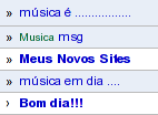
If you look the screenshots, you’ll see letters as small “e” and “a”, specially on bold, that their white space almost vanishes.
On the last shot, compare the “msg” word. Check how overlaped the “s” and “g” look on the first example.
Anti-aliasing is still good on small sizes (yes, its a question of taste) if you have hinting information provided by an artist, a font designer. Autohinting does not work well on sizes smaller than 11px or 8pt.
People, BTW, please remember that the hinting information defines how the font designer (an artist) wanted his font to look like, even with anti-aliasing enabled.
So I’m including more shots on the post to show same text with BCI enabled, and with anti-aliasing enabled. Check it out.
I think the Bitstream Vera fonts do have hinting information. Bitstream Vera Serif definitely looks different and better with BCI enabled Freetype.
Before I recompiled freetype, the slants on letters like “W” would look bad. Afterwards, it looks fine.
“BTW, anti-aliasing is useful in 2 situations only: if you are rendering fonts in big sizes (bigger than 13px)”
And guess what: LCD subpixel rendering stretches the font outline horizontally by a factor of three as its first step to account for the three subpixels in each pixel. So if you’re rendering a font at 9px, it’s as if you were rendering it at 27px across.
“or if you have bad, non-hinted fonts (as Bitstream Vera)”
Case in point: I had to switch a client’s web site from Helvetica to Arial (sorry, smug typophile weenies) because Helvetica’s hints handle this stretching poorly, causing the upper bowls of letters like m, n, and r to overshoot the x-height by a whole pixel when drawn at 14px. When FreeType’s autohinter performs better than Microsoft ClearType with BCI on Helvetica, something is up.
Note that LCD sub-pixel rendering is not a good solution. It results in colour-fringing
Nice comparison, finally Linux desktop text doesn’t look “just odd somehow” 🙂 Maybe it’s just that I’m used to the kerning on the right, coming from MS-DOS/Windows world, then moved onto Linux, now using Mac Os X, but for me it just looks better.
Hmm… I also can’t see where are the advantages of BCI from those images. I agree with Thiago. In fact, if you had switch “before” and “after” pictures, I would not be able say you did.
Wow, the new version is much uglier.